
Last week, a plane was detained at Los Angeles Airport because a passenger on the flight was showing flu like symptoms. The passenger admitted to having been in Africa recently, which caused an elevated level of alarm amongst passengers and airline officials. According to a spokesman for the Los Angeles Fire Department, Capt. Jamie Moore, it “turned out that there had been some miscommunication. This person had been to the continent of Africa but not near West Africa. As a matter of a fact, it was South Africa.”
This incident was amusing, given that South Africa is rather far from the affected area in West Africa and has not had a single case of the virus since the outbreak. This story illustrates the level of fear and anxiety that has gripped the US in the past few months. It also reminded me of just how often people misinterpret the size of certain continents and countries. In this case, the size of Africa:
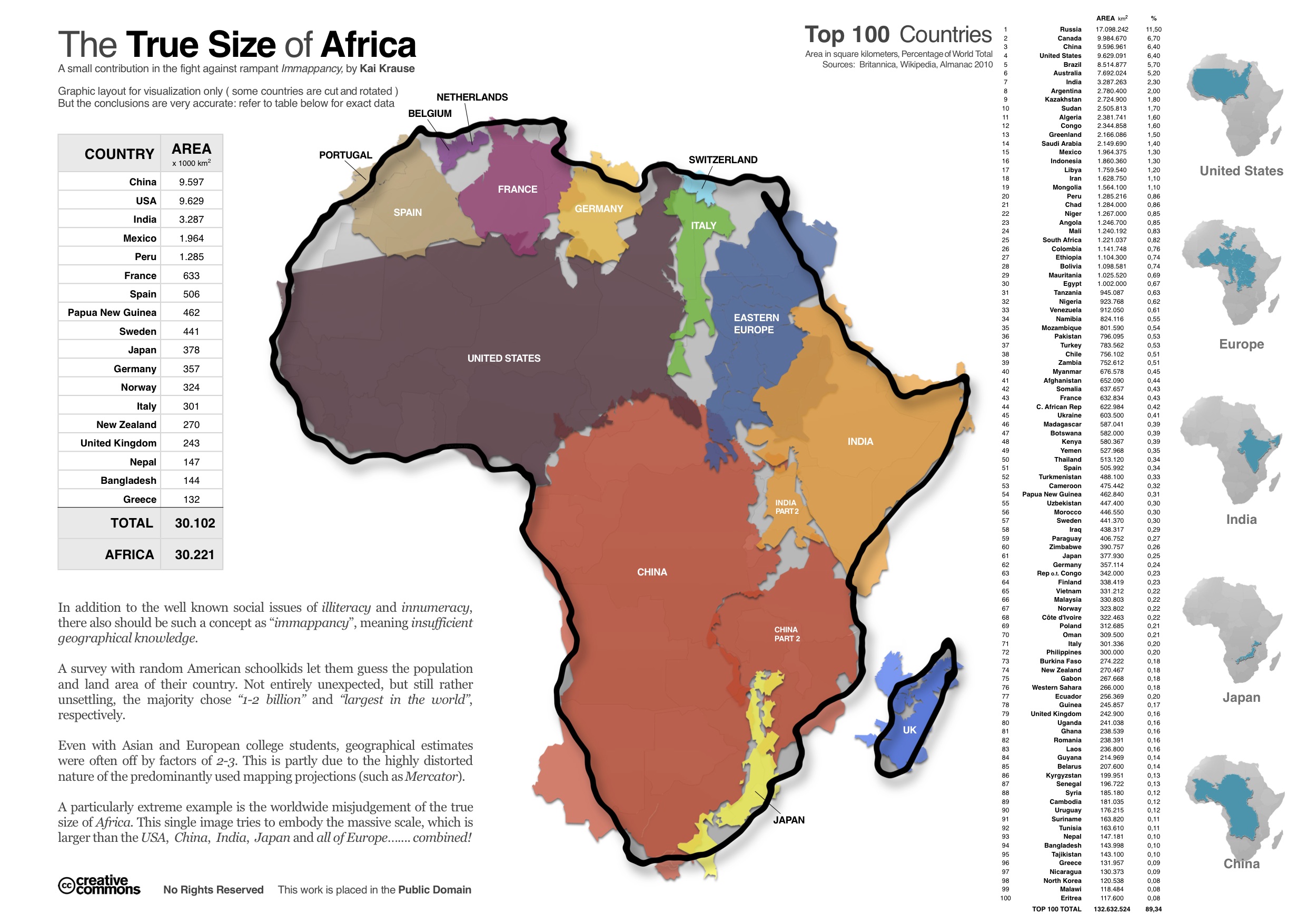
Click image to enlarge
Pretty surprising, right?
Would it also surprise you to learn that Monrovia, Liberia is closer to Paris than Johannesburg?
The map typically used in classrooms in America, known as the Mercator Map, shows Africa as about the same size as Greenland:
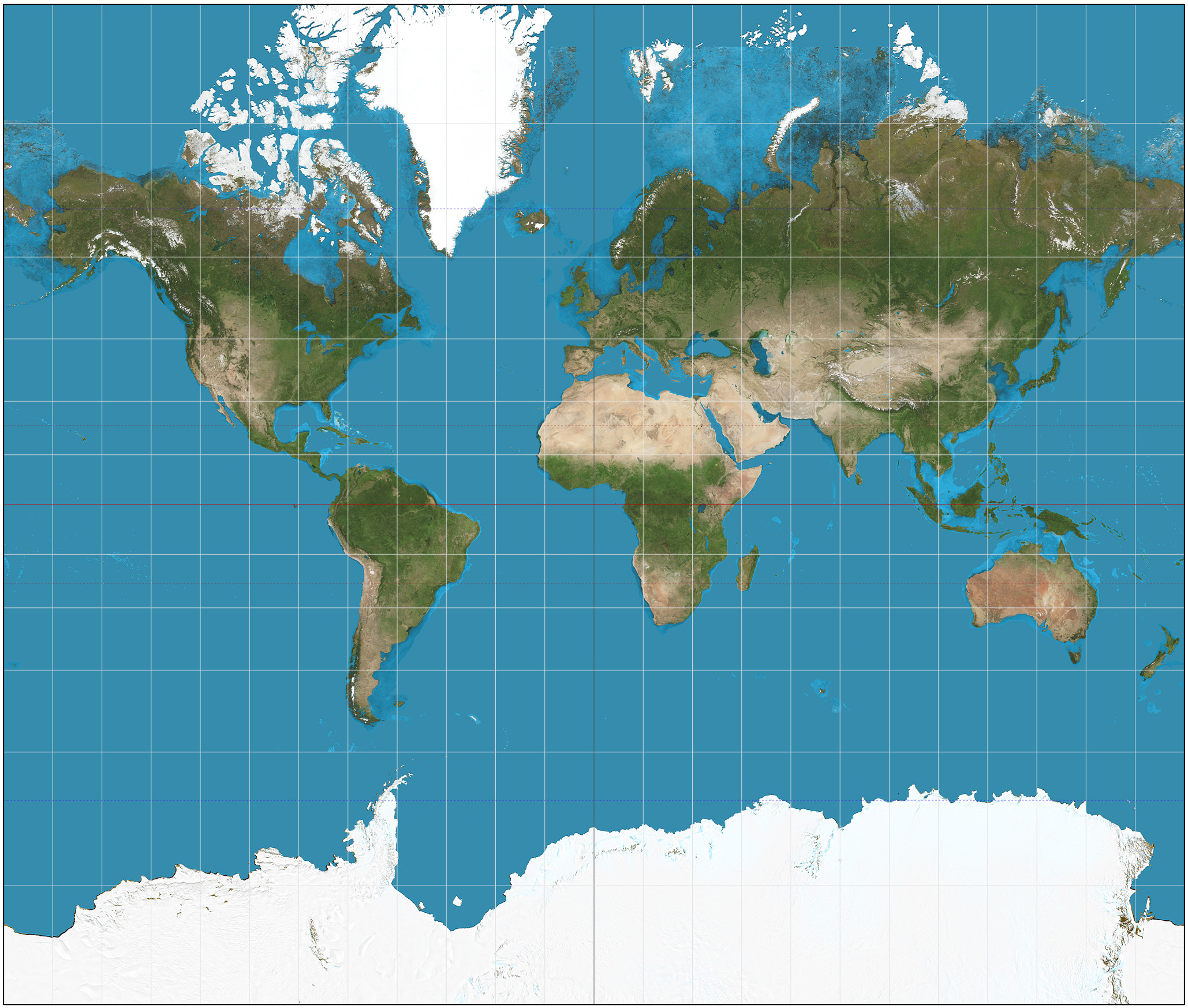
In fact, it is about 14 times larger.
This distortion is due to the fact that cartographers often modify the map of the world in some way in order to neatly fit the sphere in a flat image. Gerardus Mercator’s projection, published in 1569, was designed for seamen. The map was done by making all lines of constant bearing cross all meridians at the same angle, to make planning sea travel easier. This design, however, distorts the relative size of many countries, especially those further from the equator.
A map that better represents to size of each continent is considered to be the Gall-Peters Projection:
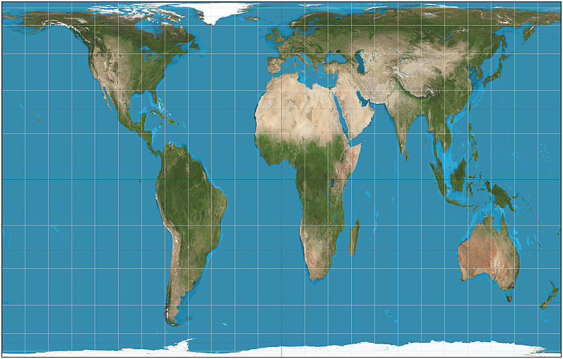
As you can see, the size of each continent is drastically different in this map, compared to the previous. This information was once used on an episode of the West Wing, where advocates promoting the Gall-Peters Projection meet the White House Staff:
While the episode may be fictitious – and, I have to admit, I am not sure how I feel about flipping the map over – it does raise some interesting questions concerning our perceptions on the relative “importance” or “power” of countries and continents. These perceptions may be due, at least in part, to our understanding of the world based on the map we have seen since childhood.